Bold Use of Color
It wouldn’t be an Applegate Tran Interiors project without bold splashes of color. In this blog article, we wanted to highlight a staple in our design process: finding the right color palette that brings a home to life. It’s typical in each of our projects to find the right use of not only color, but contrasting shapes, texture, and styles that are unique and eye-catching. We work with the client to ensure their space represents who they are. Each project is different, just like each of our clients. We’ve compiled a quick series with a few of our favorite interiors that showcase our bold use of color in every room of the home.
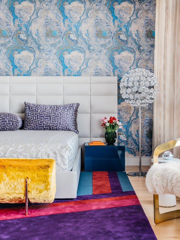

Pacific Heights
The first project we’re highlighting is our design in a posh Pacific Heights apartment located in San Francisco. Every material in this room has a different texture and pattern that contrasts with one another, yet blends cohesively to complete the overall design. In the picture above, the comforter, bed frame, and headboard serve as a point of neutrality, while the bench at the end of the bed rests upon its contrasting color in the rug with a deep purple. The wall color with shades of blue and cream plumes pick up similar tones in the bedside table and carpet. There is an overall inviting, soft quality, perfect for the bedroom.
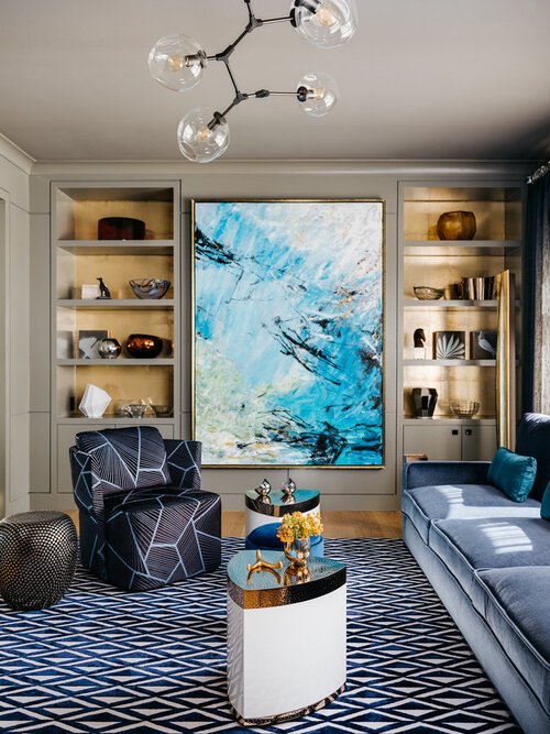
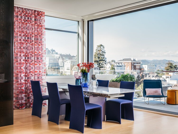
Above are also different rooms also from the Pacific Heights project where the artwork and furniture are what stand out for their bold color. The artwork and window treatment in the picture on the far right adds movement to the room with diverging lines that draws the eye in. In the middle picture, we’ve added overlapping pieces such as the chair and artwork behind it with irregular shapes, accentuating the varying tones of blue. And on the left, we have our hand-picked selection of furniture around the table in soft textures. The focus of this room is the tufted upholstered pink velvet sofa that adds a lightness to the room, playing off the artwork with dreamy tones of purple and blue.

The Orange Living Room
Many large windows allow for bright, natural light to flood the living room. Warm tones adorn this space with oranges, tans, yellows, browns, and gold in the chandelier. This room is chic and classy with a few choice pieces to bring the room together. .

Final touches. We can’t forget the spacious rooftop patio. Something we’d like to call attention to is the theme of deep purple that runs throughout the apartment from the furniture and decor inside to this outdoor sitting area, this is a constant that ties each room in the home together. The patio provides ample sitting room with an energetic color scheme set against the San Francisco Bay as the backdrop.
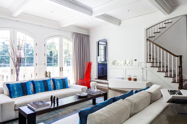
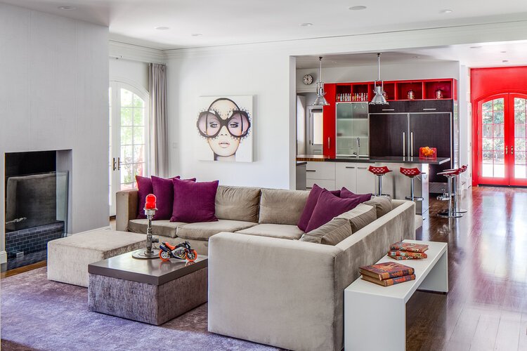
Atherton
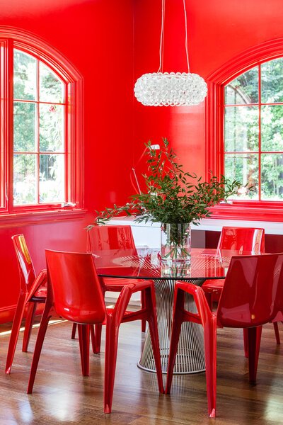
Atherton is a very unique project of ours where color plays a progressively larger role throughout the house. Bright colors are used sparingly and intentionally in these rooms where the saturation of the colors are strong and bold, adding weight to the decor as the walls serve as a neutral background. We find this brightens up the room and adds a whimsical feeling to this highly modern home.
The picture in the upper right shows the door frame in a bright, crisp red. This color is continued on the walls and window frames in the red dining room with the chairs to match. The dining table, glass chandelier, and counter on the back wall are the only pieces in this room absent of color and serve as a balancing point.
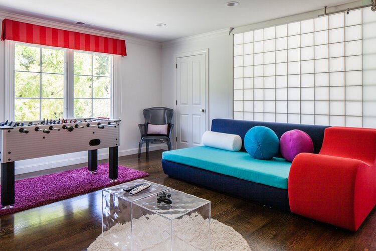
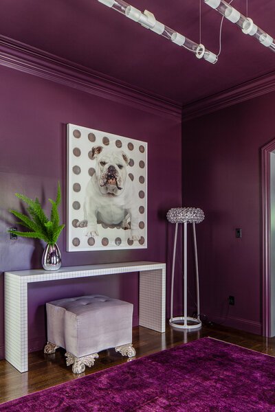
We strive to create dynamic spaces. This is achieved not only through color palettes, but irregular shapes we incorporate into each project. Adding furniture and decor that doesn’t subscribe to the traditional mold can be the element that personalizes the home for our client. The purple room to the right has been elevated with the clawfoot lavender pouf. A very distinctive piece, but it’s not the only one. In the picture above, we’ve added features to this room that make it energetic and colorful using three loud colors all in different shapes that allow the eye to move seamlessly about the room.
Portola Valley
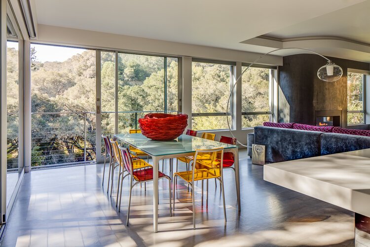
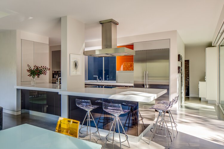
Lastly, we have a project completed in Portola Valley which we wanted to mention for our use of color in a slightly different manner. Compared to our first project in Pacific Heights where the walls, furniture, and rugs were very colorful and textured, here we have a futuristic home with rich, muted colors from the living room to the bedroom. To breathe life into this space and add a hint of color, we’ve chosen to add bright colors sparingly throughout the home. The dining room table is surrounded by transparent colored chairs that match in with the built-in kitchen features. So as not to over power, the barstools are also transparent adding a glow to the room that gives off a dazzling hue when the sunshines through them.
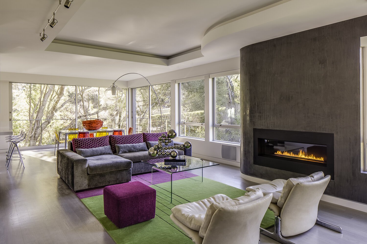
A new set of colors are introduced as we move into the living room with a purple and green carpet that sits beneath the larger pieces of neutral furniture. We wanted to mention this project because the home overall is more toned-down than other projects while still showing the clients personality, remaining spirited and quirky with these vibrant pops of color.
Thank you for coming by our website and reading our blog. We’re currently working on a project in Tiburon, CA with a gorgeous view of the Bay. Check out our Instagram page for work in progress pictures and art installations. You can find us here: @applegate_tran_interiors.